
The most recent Living Planet Report was released last year, which showed that vertebrate populations around the world have declined by 68% on average. At the time, Brian McGill wrote a post at Dynamic Ecology expressing his scepticism over these large declines. His doubts stemmed from several related papers, which all showed that vertebrate populations tended to be quite stable on average. While some populations have declined, most have remained stable and others have actually increased.
My understanding of Brian’s message (and the messages of the published papers supporting him) was that while humans do affect vertebrate populations, these effects are not consistently negative. Instead, some species benefit from human actions, so human’s ultimate legacy will be rearranging relative population structure, rather than causing wholesale declines.
While I agree with this interpretation, I worry that it is causing unwarranted mistrust of the Living Planet Index. I was reminded of this last week by a passing comment by Mark Vellend:
“If biodiversity seems intractable, then just think about recent discussions of the Living Planet Index, which is based on pretty simple underlying data.”
His remark was in the context of his post suggesting that ecologists have subconscious biases that cause us to exaggerate how much humans harm biodiversity. Ecologists probably do have subconscious biases, but the Living Planet index shouldn’t be used as evidence of this.
I don’t believe the Living Planet Index exaggerates population declines. However, I also recognise that populations are stable on average. This probably seems contradictory, so I’ll use the rest of this post to explain why it isn’t.
Stable populations on average?
Possibly the biggest cause of scepticism in the Living Planet Index is from a paper by Dornelas et al. (2019). They used regression to estimate the slopes of thousands of population time-series, and showed population trends were stable on average. (Sidenote: population dynamics are generally exponential, so a halving the population causes a smaller absolute change than doubling the same population. Dornelas et al. used a square-root-transformation to account for this, while the Living Planet Index uses a log10-transformation… but these are small technical details that don’t affect the main take-home messages here.)

Stable populations on average might seem to disagree with the idea that the Living Planet Index has declined by 68%, so one might wonder whether there are data discrepancies between those used by Dornelas et al. and those in the Living Planet Index? Nope. The population time-series in the Living Planet Database are also stable on average. I downloaded the Living Planet Database to show these patterns in this post (R-script added at the end of this post).
Before showing the results though, it is necessary to elaborate on how to quantify population trends. I compared three methods:
- Regression slope: For each population time-series, I first used a log10-transformation and then fitted a linear regression to the time-series, with log-population as the dependent variable and the year as the independent variable. The slope of this regression is essentially what is shown by Dornelas et al.
- Mean-λ: Another way to compare trends is to quantify the year-on-year change in populations as λ = log10(Nt+1/Nt). The year-on-year changes can then be averaged across every pair of sequential years in the time-series. This is essentially the approach used in the recent paper by Leung et al.
- Cumulative-λ: The third approach is basically the one used by the Living Planet Index, which is the additive combination of λ across the whole time-series. Thus, the state of the population in any year of monitoring, is the consequence of the population changes in the preceding year plus all the changes since the start the start of the time-series. This makes sense when we are trying to understand how the population has declined relative to a specific baseline – standardised to 1 – instead of the average change. (The Living Planet Index is a bit more complicated than this because it also interpolates missing data and uses weighted averages to account for geographic and taxonomic sampling biases, but these details aren’t relevant here)
The three methods show the following patterns for 15,348 population time-series in the Living Planet Database.

Both the regression slopes (a – red) and the mean-λ (b – blue) are mainly centred on zero, with considerably fewer time-series showing increasing or decreasing trends. By contrast, the cumulative-λ (c – green) is distinctly right-skewed, consistent with a declining Living Planet Index. So, just because populations are stable on average does not mean that they have not declined over the course of the sampling period.
Now, one might point out that some populations had very high cumulative-λ. This is a consequence of exponential population growth, which also means that the additive-λ cannot be summarised as the arithmetic mean, especially since declining populations are constrained by zero. This justifies using the geometric mean as the Living Planet Index does, even though mathematically this will always be lower than the arithmetic mean (and, hence, a lower Living Planet Index).
What about data quality?
In their recent paper, Leung et al. showed how mean-λ is sensitive to the length of the time-series. So, using the geometric mean to summarise average trend will always overestimate declines when short-time-series are included, even when they only represent a small minority of all populations.
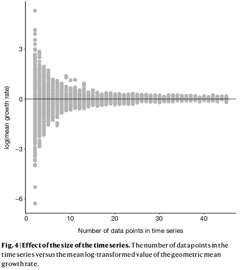
It is convenient to assume that this is an artefact of data quality: when time-series are short, they are more likely to decline or increase rapidly, but as data quality improves, the real trend can be estimated more accurately. While there might be reasons to support this assumption, this view is weakened when we look at the three types of population trends.

Here, the regression slopes (a – red) and the mean-λ (b – blue) show the same pattern as Leung et al. By contrast, cumulative-λ is quite indifferent to time-series length (if anything, longer time-series are less likely to show large increases). Therefore, the large declines in the Living Planet Index cannot be attributed to poor data from short time-series.
A simple explanation?
The discrepancy between average population trends and the Living Planet Index makes more sense once we consider a simple population that declines non-linearly from 100 to 40 individuals. This could be a species that loses habitat and then stabilises to a new, lower equilibrial population. Or it could be an exploited species that is harvested more when it is abundant and less as it becomes rarer and harder to find.

During the first few years, the population declines dramatically and this would be captured by steep regression slopes and low mean-λ. But as the years pass, the slopes get shallower and shallower and the intercepts (and, thus, mean populations size) get smaller and smaller. This is an example of a shifting baseline syndrome.
Perversely, as the time-series continues along the new equilibrium, both the regression slopes (a – red) and the mean- λ (b – blue) tend towards zero! In comparison, cumulative-λ tracks the real population declines almost perfectly.

Thus, the change in trends due to longer time-series does not necessarily represent more accurate estimates of true trajectories. Instead, it is likely because the baseline constantly changes as new data is collected. Cumulative-λ locks-in declines because it is additive, and this explains the discrepancy between the Living Planet Index and average population trends. This discrepancy will always be true as long as population trajectories are non-linear, which – according to the paper by Di Fonzo et al. – is most often the case.

A short summary
Since this was a big data-dump, I thought I’d summarise the main take-home messages:
- First, populations being stable on average does not mean that there aren’t widespread declines as shown by the Living Planet Index.
- Second, the Living Planet Index considers additive declines relative to a fixed baseline of 1970 population levels. So, historical declines are ‘locked-in’ even when populations stabilise to new stable equilibria.
- Third, the mathematical characteristics of exponential population growth require that the LPI must necessarily be summarised as the geometric mean. This will inevitably lead to lower averages and, hence, greater declines than simply considering the arithmetic averages.
- Fourth, while data quality is always an important consideration, we shouldn’t assume by default that trends estimated from longer time-series reflect population trajectories more accurately than trends from short time-series. This is especially true when population trajectories are non-linear.
I support suggestions that global biodiversity indicators should be more nuanced and multidimensional. But that doesn’t mean that single metrics like the Living Planet Index are flawed. In fact, I’d argue that the features of the Living Planet Index (i.e. fixed baseline and additive declines) might even provide a more realistic image of the shifting state of the planet’s biosphere.
The R-script
# Open  dataset after downloading it from: http://stats.livingplanetindex.org/
lpi <- read.csv("LPR2020data_public.csv", na.strings = "NULL")

# Create a new object that only includes the population data, without any metadata.
# This includes data from 1950 to 2018
pop.mat <- lpi[,30:98]
years <- 1950:2018
dim(pop.mat)
# Create blank vector for the length of the sampled time-series
length.val <- rep(NA, dim(pop.mat)[1])
# Create blank vector for the slope from regression
linear.slope <- rep(NA, dim(pop.mat)[1])
# Create blank vector for mean lambda
lam.mean <- rep(NA, dim(pop.mat)[1])
# Create blank vector for addive lambda values
lam.val <- rep(NA, dim(pop.mat)[1])

# Run a loop for each population time-series
for (i in 1:dim(pop.mat)[1]){
	# Population of species i
	pop.vect <- pop.mat[i,]
	# Remove missing data
	val.vect <- pop.vect[!is.na(pop.vect)]
	# Add a low dummy value for extinct populations to prevent devision by zero
	val.vect[which(val.vect==0)] <- 1e-99
	# Isolate the years with sampling data
	year.vect <- years[!is.na(pop.vect)]
	# Save the length of the time-series to the blank vector
	length.val[i] <- length(val.vect)

	#Only calculate change when there are more than one time-points
	if (length(val.vect)>1){
		# Get the slope from a liinear regression
		linear.slope[i] <- lm(log10(val.vect)~year.vect)$coefficients[2]
		# Calculate the lambda values for pair of sequential time-points
		lambda <- log10((val.vect[-length(val.vect)]+diff(val.vect)) / val.vect[-length(val.vect)])
		# Get the mean of the lambdas
		lam.mean[i] <- mean(lambda)
		# Calculate the additive change from a baseline = 1 for all the lambdas
		lam.val[i] <- (1*10^cumsum(lambda))[length(lambda)]
	} else {
		# Add default value for time-series with single measurements
		linear.slope[i] <- 0
		lambda <- 0
		lam.mean[i] <- 0
		lam.val[i] <- 1
	}
}

# Save the population changes as histograms
png(filename="Histograms.png",width=24,height=8,units="cm",res=300)
par(mai=c(0.55,0.55,0.05,0.05))
par(mfcol=c(1,3))

# Define the breaks to visualise the histogram
brk <- c(min(linear.slope)-1,seq(-2,2,by=0.025),max(linear.slope)+1)
# Plot the histogram
hist(linear.slope, breaks=brk, las=1, ylim=c(0,8),xlim=c(-0.75,0.75), main="",
	xlab="Regression slope", col=rgb(1,0,0,0.5), border=NA,
	cex.axis=1.1, cex.lab= 1.3, mgp=c(2.5,0.6,0))
# Add a line for "no-change"
abline(v=0, lty=2, lwd=2); box()
# Add panel label
mtext("a",cex=1.3, side = 3, adj = 0.9, line = -2,font=2)

# Define the breaks to visualise the histogram
brk <- c(min(lam.mean)-1,seq(-2,2,by=0.025),max(lam.mean)+1)
# Plot the histogram
hist(lam.mean, breaks=brk, las=1, ylim=c(0,8),xlim=c(-0.75,0.75), main="",
	xlab="Mean lambda", col=rgb(0,0,1,0.5), border=NA,
	cex.axis=1.1, cex.lab= 1.3, mgp=c(2.5,0.6,0))
# Add a line for "no-change"
abline(v=0, lty=2, lwd=2); box()
# Add a line for "no-change"
mtext("b",cex=1.3, side = 3, adj = 0.9, line = -2,font=2)

# Define the breaks to visualise the histogram
brk <- c(seq(0,5,by=0.1),max(lam.val)+1)
# Plot the histogram
hist(lam.val, breaks=brk, las=1,  main="",
	xlab="Cumulative lambda", col=rgb(0,1,0,0.5), xlim=c(0,5), border=NA,
	cex.axis=1.1, cex.lab= 1.3, mgp=c(2.5,0.6,0))
# Add a line for "no-change"
abline(v=1, lty=2, lwd=2); box()
# Add a line for "no-change"
mtext("c",cex=1.3, side = 3, adj = 0.9, line = -2,font=2)
# Save plot
dev.off()

# Save the population changes relative to time-series length
png(filename="TimeSeries Length.png",width=24,height=8,units="cm",res=300)
par(mai=c(0.55,0.55,0.05,0.05))
par(mfcol=c(1,3))

# Plot the population change vs. time-series length
plot(length.val,linear.slope,col=rgb(1,0,0,0.05), las=1,
	pch=16,cex=1.5, ylim=c(-1.75,1.75), xlab="Time-series length",
	ylab="Regression slope",cex.axis=1.1, cex.lab= 1.3,
 mgp=c(2.5,0.6,0)); abline(h=0,lty=2,lwd=2)

mtext("a",cex=1.3, side = 3, adj = 0.9, line = -2,font=2)

# Plot the population change vs. time-series length
plot(length.val,lam.mean,col=rgb(0,0,0.8,0.05), las=1,
	pch=16,cex=1.5, ylim=c(-1.75,1.75), xlab="Time-series length",
	ylab="Mean lambda",cex.axis=1.1, cex.lab= 1.3,
 mgp=c(2.5,0.6,0)); abline(h=0,lty=2,lwd=2)
# Label panel
mtext("b",cex=1.3, side = 3, adj = 0.9, line = -2,font=2)

# Plot the population change vs. time-series length
plot(length.val,lam.val,col=rgb(0,0.8,0,0.05), las=1,
	pch=16,cex=1.5, ylim=c(0,5), xlab="Time-series length",
	ylab="Cumulative lambda",cex.axis=1.1, cex.lab= 1.3,
 mgp=c(2.5,0.6,0)); abline(h=1,lty=2,lwd=2)
# Label panel
mtext("c",cex=1.3, side = 3, adj = 0.9, line = -2,font=2)
# Save plot
dev.off()

# Toy model
# Create a year vector
years <- 1970:2020
# Standardise years between 0 and 1
x <- seq(0,1,l=length(years))
# Simulate a population that decline from 100 to 40 along a concave-up trajectory
pop<- ((60*(1 - x^.25)) + 40)

# Save the simulated population time-series as a plot
png(filename="Population.png",width=15,height=15,units="cm",res=300)
par(mai=c(0.75,0.75,0.05,0.1))
# Make plot
plot(pop~years, las=1, type="o",pch=16,cex=1.5, col="grey", ylim=c(0,120), xlab="Year",
	ylab="Population",cex.axis=1.1, cex.lab= 1.3,  mgp=c(2.5,0.6,0))
# Save plot
dev.off()

#Create blank vectors for population changes for increase time-sereis lengths (minimum of 2 years)
slope <- rep(NA, length(years)-1) 	 # Regression slope
lam <- rep(NA, length(years)-1)		 # Mean lambda
cum.lam <- rep(NA, length(years)-1)	 # Cumulative lambda

# Run a loop to calcualte population changes fro increasing time-series length
for (i in 2:length(years)){
	# Slope from regression
	slope[i] <- lm(pop[1:i]~years[1:i])$coefficients[2]
	# Lambda values
	lambda <- log10((pop[1:i][-length(pop[1:i])]+diff(pop[1:i])) / pop[1:i][-length(pop[1:i])])
	# Mean Lambda
	lam[i] <- mean(lambda)
	# Cumualtive lambda
	cum.lam[i] <- (1*10^cumsum(lambda))[length(lambda)]
}

# Set baseline for cumulative lambda
cum.lam[1] <- 1
# Length of time-series
ts.length <- 1:length(years)

# Plot how sample completeness affects popualtion change estimates
png(filename="Data detail.png",width=24,height=8,units="cm",res=300)
par(mai=c(0.55,0.55,0.05,0.05))
par(mfcol=c(1,3))

# Plot the population slopes
plot(ts.length,slope,col=rgb(1,0,0,0.5), las=1,
	pch=16,cex=1.5, ylim=c(-35,0), xlab="Time-series length",
	ylab="Regression slope",cex.axis=1.1, cex.lab= 1.3,
 mgp=c(2.5,0.6,0)); abline(h=0,lty=1,lwd=1)
# Label panel
mtext("a",cex=1.3, side = 1, adj = 0.9, line = -2,font=2)

# Plot mean lambda
plot(ts.length,lam,col=rgb(0,0,0.8,0.5), las=1,
	pch=16,cex=1.5, ylim=c(-0.2,0), xlab="Time-series length",
	ylab="Mean lambda",cex.axis=1.1, cex.lab= 1.3,
 mgp=c(2.5,0.6,0)); abline(h=0,lty=1,lwd=1)
# Label panel
mtext("b",cex=1.3, side = 1, adj = 0.9, line = -2,font=2)

# Plot cumulative lambda
plot(ts.length,cum.lam,col=rgb(0,0.8,0,0.5), las=1,
	pch=16,cex=1.5, ylim=c(0,1), xlab="Time-series length",
	ylab="Cumulative lambda",cex.axis=1.1, cex.lab= 1.3,
 mgp=c(2.5,0.6,0)); abline(h=1,lty=1,lwd=1)
# Label panel
mtext("c",cex=1.3, side = 1, adj = 0.9, line = -2,font=2)
# save plot
dev.off()

Pingback: Friday links: Covid-19 vs. BES journals, Charles Darwin board game, and more | Dynamic Ecology